在数据可视化项目中,我们经常需要将大量数据分组展示,并为不同批次的数据设置不同的颜色以便区分。ECharts中实现按数据批次设置柱状图颜色的方法,适用于从接口获取动态数据的场景!✔️♨️
方法一:基于数据索引的批次颜色设置
实现步骤
1,准备数据
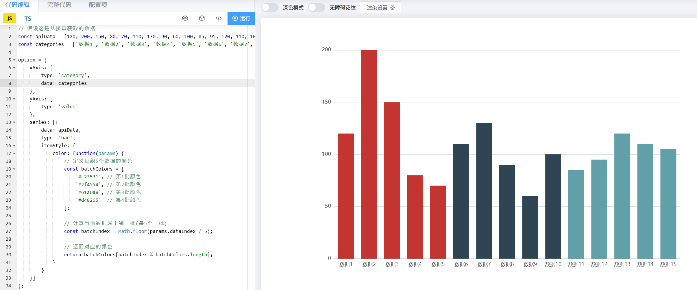
// 模拟从接口获取的数据
const apiData = [120, 200, 150, 80, 70, 110, 130, 90, 60, 100, 85, 95, 120, 110, 105];
const categories = ['数据1', '数据2', '数据3', '数据4', '数据5', '数据6', '数据7', '数据8', '数据9', '数据10', '数据11', '数据12', '数据13', '数据14', '数据15'];2,配置ECharts选项
const option = {xAxis: {type: 'category',data: categories},yAxis: {type: 'value'},series: [{data: apiData,type: 'bar',itemStyle: {color: function(params) {// 定义每组5个数据的颜色const batchColors = ['#c23531', // 第1批颜色'#2f4554', // 第2批颜色'#61a0a8', // 第3批颜色'#d48265'  // 第4批颜色];// 计算当前数据属于哪一批(每5个一批)const batchIndex = Math.floor(params.dataIndex / 5);// 返回对应的颜色return batchColors[batchIndex % batchColors.length];}}}]
};3,初始化图表
const myChart = echarts.init(document.getElementById('main'));
myChart.setOption(option);
适用场景
-
数据量固定且需要均匀分组
-
后端返回的是简单数组数据
-
需要根据数据位置自动分组
方法二,基于数值范围的自动分组
1,配置visualMap组件
const option = {// ...其他基础配置visualMap: {type: 'piecewise',pieces: [{min: 0, max: 100, color: '#c23531'},    // 第一批颜色{min: 101, max: 150, color: '#2f4554'}, // 第二批颜色{min: 151, max: 200, color: '#61a0a8'}  // 第三批颜色],seriesIndex: 0},series: [{// ...系列配置}]
};
方法三:最基本的自定义颜色
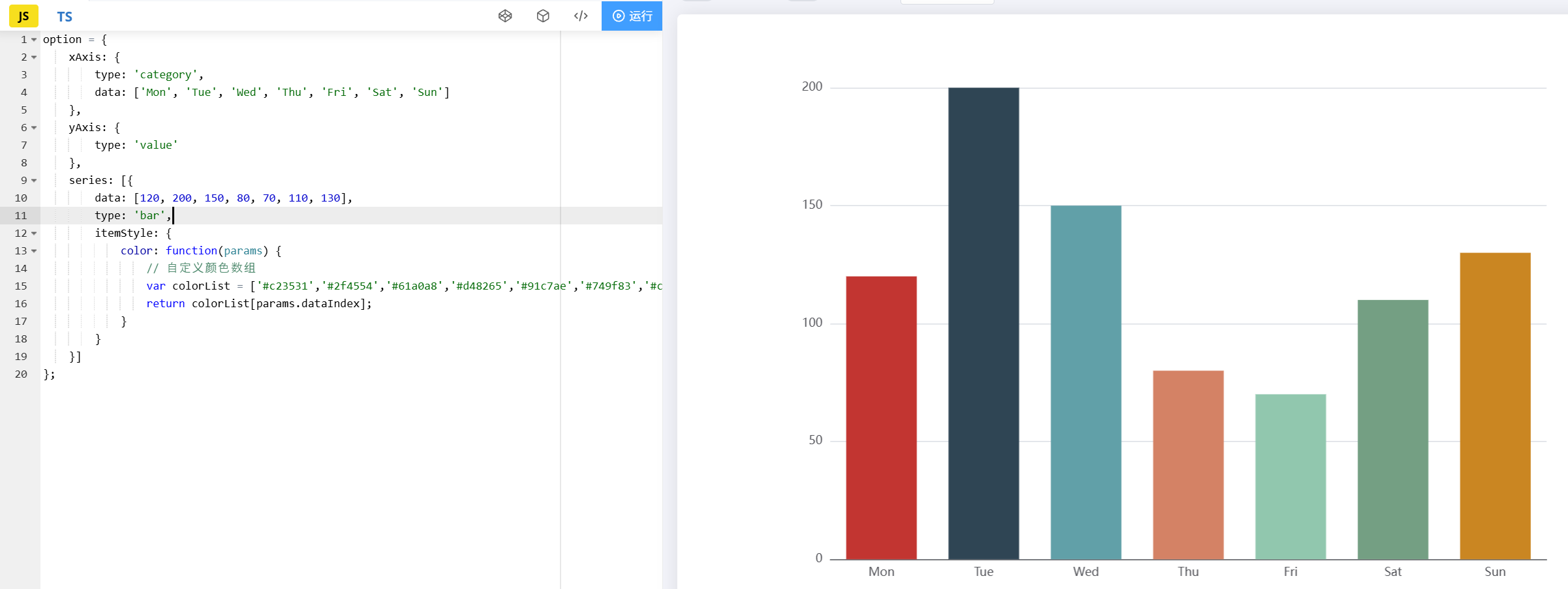
3.1 使用series.itemStyle.color
option = {xAxis: {type: 'category',data: ['Mon', 'Tue', 'Wed', 'Thu', 'Fri', 'Sat', 'Sun']},yAxis: {type: 'value'},series: [{data: [120, 200, 150, 80, 70, 110, 130],type: 'bar',itemStyle: {color: function(params) {// 自定义颜色数组var colorList = ['#c23531','#2f4554','#61a0a8','#d48265','#91c7ae','#749f83','#ca8622'];return colorList[params.dataIndex];}}}]
};
3.2 使用visualMap组件根据数值自动分配颜色
option = {visualMap: {min: 0,max: 200,inRange: {color: ['#50a3ba', '#eac736', '#d94e5d']}},series: [{// ...其他配置}]
};